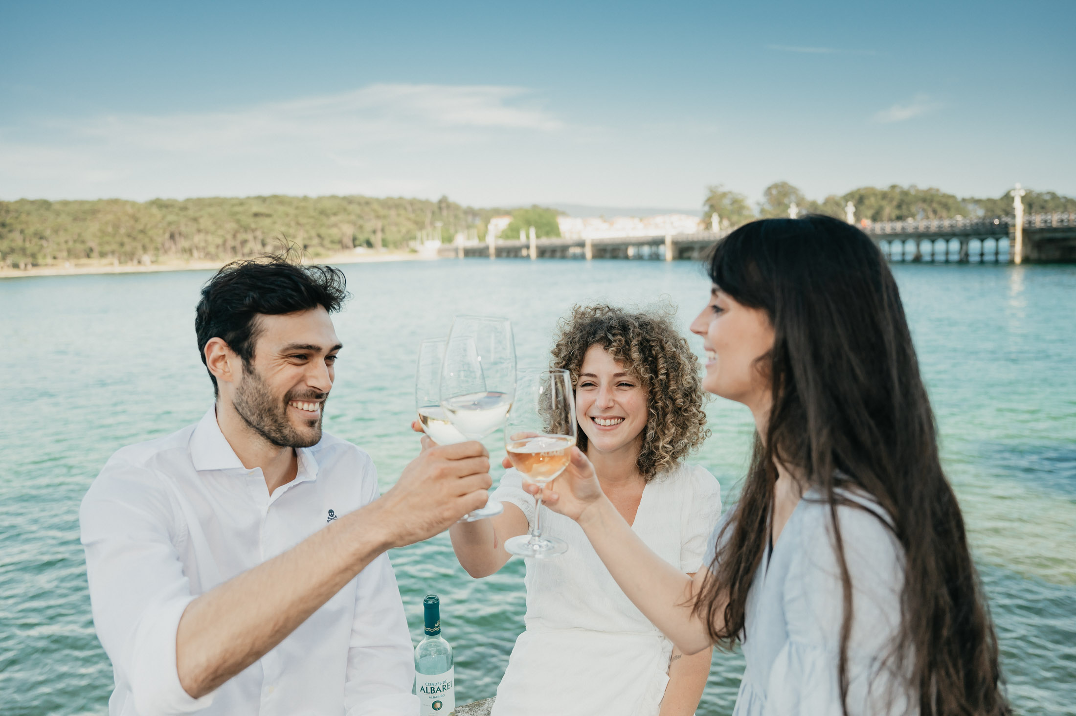
Condes de Albarei presents its new corporate Image

Condes de Albarei presents its new corporate Image
In an ever-changing world, standing still is not an option. At Condes de Albarei we know that reinventing ourselves, adapting to new realities and looking forward to the future, without forgetting the past, is something fundamental.
Therefore, after a lot of work, effort, time and dedication, we want to show you the final result of a project that began in the year 1988, and that today, is more alive than ever.
The year 2021 will be marked in our calendar forever, marking a before and after in Adega Condes de Albarei.
Our winery launches a new corporate image, leaving behind its emblematic logo and opting for innovation, modernity, and freshness.
A new identity that looks to the future, without leaving aside everything that made us into what we are today. Our tradition and values, essential elements of our winery, remain untouched with the passing of time.
If you would like to know more about the new corporate identity of Condes de Albarei, we invite you to keep on reading this post.
The colour that defines us
There is a one and only colour which accompanies us every day in our vineyards. A colour that we have the fortune to enjoy every time we raise our eyes towards the Arousa estuary, the same colour that has marked the image of our winery since that one first harvest in the year 1988.
We are talking about the colour green, which is now reflected in our new logo and label, and signifies tradition, origin, and distinctiveness. On the other hand, the colour gold appears to transmit all the quality and prestige of the Albariño grape.

Elements that unite us
Of course, it is not only the colours on the new label which tell us about Condes de Albarei. Each element, each form, has its own meaning.
The circle symbolizes the main ingredient and our reason for being: the Albariño grape. It also generates a link with our winery Pazo Baión, since the grape is the ultimate element of its logo.
But not only that, it is also a symbol of the union of all the winemakers who make up Condes de Albarei, and a simple way of transmitting, through a circumference, the perfect balance of our Albariños.
The waves evoke our estuary and the ocean, two key elements which shape our surroundings, giving our grapes that characteristic and distinctive uniqueness of our area.
Albarei is Salnés, Salnés is Galicia
Last but not least, there are very important words in this new design.
The words “Salnés” and “Galicia” accompany the trademark of our winery, helping people to place it on the map.
In essence, with this new image we seek to convey a perfect harmony between all the elements which make up Condes de Albarei. And, hopefully, it will generate in you the same emotions that we feel when we uncork one of our bottles.
Because when the excitement reaches us, there is so much that we need to share, which words cannot amount to.


